© Loren Madsen, 2019
It’s not often that scholars can point to art galleries as good places to see terrorism data, but data visualization artists are working to change that.
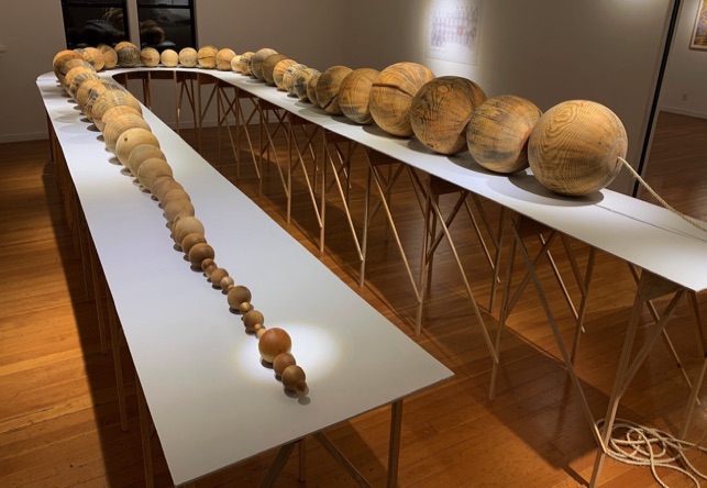
Loren Madsen, a California-based artist, used data from the Global Terrorism Database (GTD) for an art installation called Worry Beads, which was exhibited at the Willits Center for the Arts in California in January this year.
Worry Beads is comprised of two strings of beads, which are primarily made of locally sourced pine and fir wood, and was crafted on a homemade lathe.
While both strings of beads are at the same scale, the larger string of beads—representing the number of deaths by terrorism globally every year from 1945 to 2017—is 40 feet long. By comparison, the smaller string of beads, representing the number of deaths by terrorism in the United States, is only 50 inches long.
“People were surprised to see how little terrorism happens here,” Madsen said. “People were going ‘Wow!’ and they would start talking with me about the numbers, and I found that wonderful.”
Madsen used GTD data on global terrorism deaths for the years 1970 to 2017, and for the years between 1945 and 1970 he used data from the State Department and RAND Corporation.
“People are walking around being afraid and I’m not, and that was because I knew the numbers,” Madsen said. “I would get into arguments with people who are smart and well informed and well educated, and they had these crazy notions about how many people died in terrorist attacks.”
Madsen first became interested in social science data in college, when he was initially a political science major, before he decided to major in art. “I always had that interest,” Madsen said. “I had a nice run as an artist, got some attention, but things changed. I became more interested in the world around me.”
Thirty years after college, while teaching graduate school in New York City in the 1990s, he was appalled to hear about his students’ living costs. “My students talked about how much they paid for tuition, rent, and so on. I remembered how my house was $75 dollars a month and you could buy a car for $300 when I was a student.”
This experience led him to create his first data visualization piece, CPI/Cost of Living, a sculpture which reflected the rising Consumer Price Index (CPI) for food, gasoline and electricity over time. Since then, he has made many more works of art focusing on data visualization, with Worry Beads being his most recent.
This is not the first time that GTD data has been incorporated into artwork. Emily Lazerwitz, an American artist currently working in London, used GTD data for her work called the Archive, which is comprised of rugs made with depictions of the data.
Lazerwitz used a process called speed tufting, in which she wove wool by hand into 148.5 x 115.5 cm rugs.
“At the time, I was very much interested in looking into the perception versus the reality of terrorism in the USA,” Lazerwitz said. “To start this research I was looking for a database or record system that had a list of terrorism attacks in the USA, which led me to find the GTD.”
Like Madsen, Lazerwitz has experience in working with data, in addition to being trained as an artist.
“I have a background in mathematics so I have spent a lot of time looking at data and numbers and thinking about how they are represented in other contexts,” Lazerwitz said.
As to why she chose rugs as the format for presenting the data, Lazerwitz said, “That is in part because of the weight that the rugs have and the slowness of the process. It also references domestic [life] and brings this data back into the home. There is also a sort of humor to the work, which I think adds a tension to the pieces which I like.”
Whether it’s weaving terrorism data into rugs, or crafting banners of CIA documents concealed by dazzle camouflage, Lazerwitz wants her art to invite those observing it to reflect on the world around them.
“I would like to challenge [the public’s] perception and ideally have them learn something new,” Lazerwitz said. “Whether that happens—I cannot be certain.”
START researchers praised the efforts of these artists in exploring ways to present data visually, in a manner that allows the public to grasp the implications of the data easily and intuitively.
“These tangible representations of the GTD communicate information in creative ways that can uniquely reach people. They provoke thought and even challenge problematic conventional wisdom, which is always fantastic,” GTD Program Manager Erin Miller said.
The artists themselves also noted the impact that working with hard data has had on their own lives, both personally and professionally.
“There’s a little bit of therapy and also a calming of my own fears,” Madsen said about working with terrorism data.
“Even though [my family and I] were in New York on 9/11 and we were within a mile of the Towers and we saw the whole thing. In Worry Beads, the beads get larger and larger, [but] it doesn’t involve the U.S. So while it’s horrific, it’s not nearby, which I find calming.”